
Whether you are preparing to design a website, a business presentation, or working on graphic design concepts for your business . The types of fonts you choose can make a big difference.
However, with hundreds of thousands of fonts available to choose from, it’s not always easy to figure out which Font is best for a particular project.
It can also be difficult to recognize the subtleties between certain lines since many styles today can share many similarities.
Read on to learn more about the specific characteristics of the different types of fonts and the typical applications of each of them.
Gift : a link to a site that offers you most of the fonts for free
The different types of fonts and how to use them ?
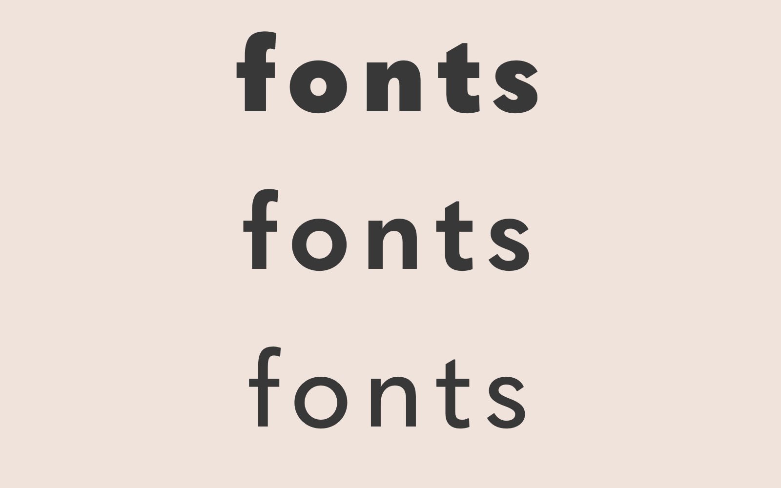
Fonts vary greatly depending on the shape, size and style. Although there are countless fonts available today, the vast majority of them can be organized into three distinct categories. These font types include serif, sans serif, and formal script.
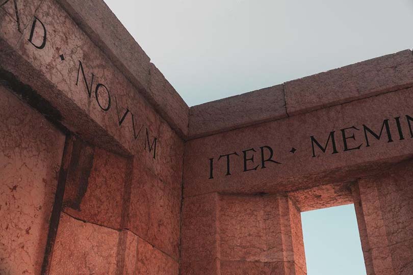
Serif lines
Serif is one of the most popular fonts in the world, featuring a large collection of stylized fonts used in book printing for centuries. The letters in serif fonts have additions, often called “feet”, which help to make it easier to read the written word. The elegant and traditional appearance of serif fonts makes them ideal for presentations or professional correspondence.
Serif lines of the XVIII century
The most accurate form of the serif typeface in the XVIII century was the Caslon font, invented by William Caslon in the early twenties of the XVIII century. This form of the serif font uses a letter known as the long letter s which is similar to the lowercase letter F and a connected stroke is applied when the CT characters are side by side in the word. On the page, eighteenth-century fonts such as the Caslon font give the writing a romantic and sophisticated quality. However, it can be difficult for modern people to read the lines of the XVIII century, especially when viewed on a monitor.
Serif transition lines
By 1757, a man named John Baskerville sought to improve the Caslon script by introducing a different style of serif script. This new Baskerville font was easier to read as many of the zigzag and stylized touches of the previous thin font shapes were completely removed. Today, transitional serif fonts such as the Baskerville font are still in common use, creating elegant and refined text blocks that are very similar to modern fonts such as The Times New Roman.
Slab Serif lines
The wider serif fonts are usually used today in promotional materials, T-shirts, sports T-shirts and book covers. Slab serif is also commonly used on signs for shop fronts or movie posters. Slab serif fonts are ideal for capturing the reader’s attention at a glance. On the other hand, using slab serif for whole sentences or paragraphs can be confusing for many due to the enormous weight and width of the letters. Some popular modern versions of slab serif lines include Courier, Rockwell and Clarendon.
Sans Serif lines
In French, the word “sans” is translated as “without” , and as you might think
. Instead, the characters in the sans serif typefaces are reduced to their simplest form to create a consistent, easy-to-read text. Within the sans serif font family, there are three main subcategories.
Geometric lines
Consistency is one of the most important principles of Universal presentation design, which
makes san serif geometric lines a good choice to make a strong impression during your next business meeting.
Using geometric lines, curved letters take on a rounded, rounded appearance. At the same time, letters with sharp corners have a more angular shape. The bold and more pronounced appearance of geometric lines makes it ideal for company logos, letterheads or advertising.
Humanitarian lines
This type of sans serif font is designed according to traditional Roman letters. Human fonts can be distinguished from other sans serif fonts due to the continuity of presentation in strokes.
In addition, humanized fonts are designed to resemble cursive handwriting in some ways, which
gives the Font a unique natural look.
While very popular during the medieval era, many graphic designers and publishers today tend to prefer
to use less outdated typefaces for printed materials.
Ugly new characters
Wonder fonts first appeared in the late nineteenth century and were characterized by curves of several letters of varying widths .
Gradually, the strange fonts were refined into new grotesque different fonts that people might recognize today such as Helvetica. In design talk, neo-grotesque refers to a type of sans serif fonts that have sharper, more defined lines and fewer variations between character ratios.
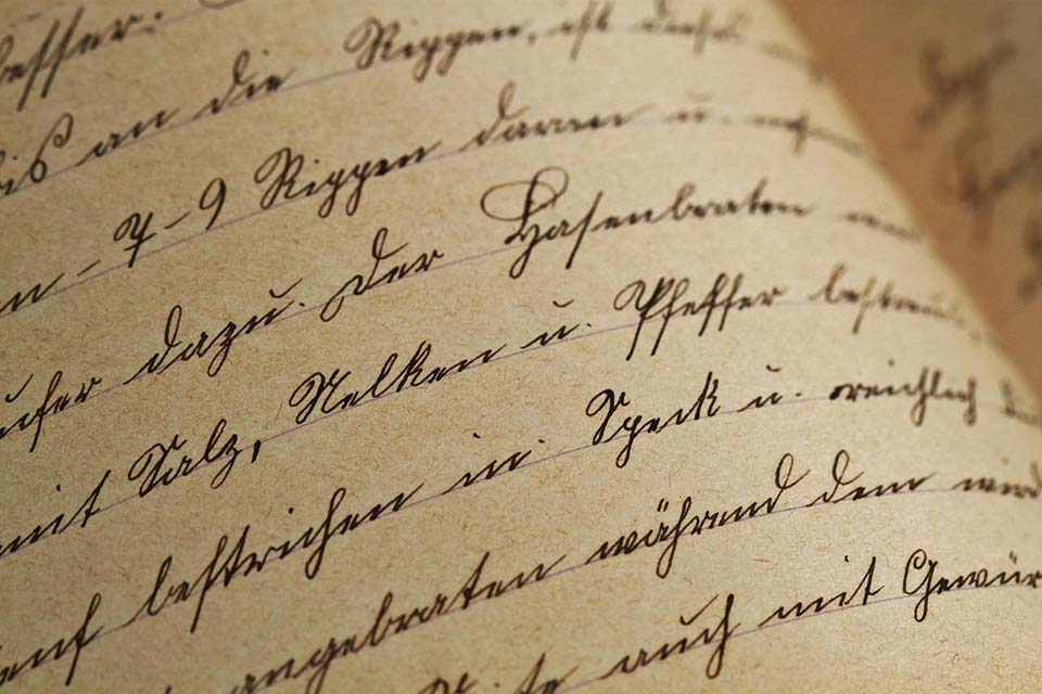
Formal script fonts (also called decorative fonts or display fonts)
With formal text fonts, the letters appear as if they were handwritten following a traditional font style.
The elegance of these decorative lines makes them a suitable choice for event invitations such as
weddings, banquets or other formal gatherings. Some forms of decorative fonts have a very
exaggerated emphasis on certain characters while others are more subdued to resemble natural cursive handwriting.
Use the correct font style for the job
The type of font you choose to use depends on the purpose of the writing, the audience, and the impression you hope to make on readers.
For business presentations or informal correspondence, a modern serif or sans serif font is usually the best option. Some of the most common fonts used in daily communication today include Courier New, Times New Roman, Helvetica, Calibri and Arial.
If you want to add a specific font to your site, you can check out the article How to add a specific font to your site.